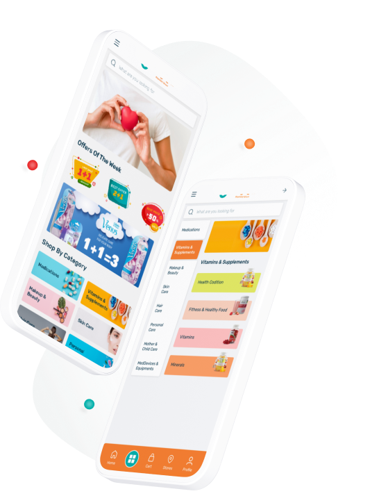
Order prescription, manage medication, make life easier
We created a modern design of Orange Medicine
store application where people can buy and collect
the medicine they need without any hassle.
Now we want to tell you about this project.
© 2021 SnapTec · ALL RIGHTS RESERVED
All what you need & more
Orange Pharmacies is an innovative group of pharmacies was established in the beginning of 2003, when the establishment of the first branches of the group was beginning.
The group aims to provide distinctive pharmaceutical and medical services and to provide all pharmaceutical preparations in addition to cosmetic and children's supplies with high quality and competitive prices.
Make it easier to buy medicines online
Our task in this project was to make buying medicin online easy. When peoples ones are sick, the least they want to do is spend a lot of time buying medicines.
Very often we see that medicine cannot be found even after many searches. And if one drug is found, another drug cannot be found in the same store.
Buying medicine offline while the COVID- 19 epidemic becomes a big risk. Not to mention the revolutionary changes to the needs an expectations of clients which have been brought about the new reality of pandemic restrictions and require proper attention.
#Challange- Getting order by prescription;
- Effectively showing the details of medicine;
- Making fast & easy order process.

Online store app that's a similar with store
After conducting the initial research of these pain points, our goal is to create e -commerce online store app that mimics a similar experience as shopping in store.
Projects goals
Creating online store that mimics a similar experience as shopping of products in -store while providing solution to solve the pain points in order to drive frafic to the app.
Users goals
Be able to quickly find and easily buy necessary medicines. Provide an intuitive jorney with easy steps from start to finish. Include health precautions and practices in the shopping process during the pandemic.
Business goals
Awaring people the benefits of online shopping while expanding customer base and market share.
Project stages
It was user - centered design process, focused on the users and their needs in each phase of the design process. In the process we involved the users throughout with variety of research and design techniques, so that we can make an really useful and usable product for them.


In the first phase of the project, we focused on research, user flows, mapping the information architecture, and creating wireframes.
After wireframes were initially tested by users, we proceeded to UI creation of high-fidelity mockups. With a solid basis of UX findings, the visual part of the app was designed, including interactions.
In the final stage, we created a comprehensive style guide with a basic description for the development process.


Research helps to define the challenges and goals
The goal of the research phase was to gather crucial insights about pharmacy retail market as well as understand the perspective of the end - users - store customers.
We explored the topic using desk research, competitive analysis and user surveys, which led us to formulate a set of recommendations for features and build user flows.


Key metrics
Let us introduce you to the pharmacy landscape of the KSA, the main retailers and distributors, and some of the key health and wellness opportunities in this market.
- $10 191.4 million
The Saudi Arabia pharmaceutical drugs market is to be valued at
- Source:
- www.coherentmarketinsights.com
- 7.3%
Expected to exhibit a CAGR over the forecast period (2020-2027
- Source:
- www.coherentmarketinsights.com
- 5 000.0
Number of pharmacies across Saudi Arabia.
- Source:
- www.bolstglobal.com
- Saudi consumers will usually seek out the professional opinion of a Pharmacist or Doctor when looking to take vitamins, minerals and supplements.
- There are over 5,000 pharmacies across Saudi Arabia. Many of which are more accessible to smaller communities outside of urban areas than supermarkets or hypermarkets.
- Recent trend for Saudi pharmacies to expand their reach by introducing ‘golden branches’ to offer consumers a much wider range of products.
- Young, female consumers with newfound purchasing power are willing to invest in health and wellness brands, particularly premium, quality products.Thanks to the younger female generation’s increased independence and personal income, this presents an opportunity for brands to maximise reach by targeting this demographic.

User Research
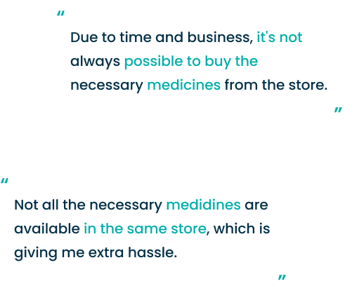
After I got the big picture, a user survey was conducted to determine how potential consumers buy products in pharmacy stores. Some of their frustrations listed below.

Provisional Personas
User Personas are your Target Audience for whom we are making the Product so in the Research phase. I also created Persons to Create a Better Experience for user.

Djamila is working as a teacher. She is a mon who works full time with 2 children.
Health and wellness product categories are interested for Djamila:
- weight management and diet products;
- vitamins, minerals and other supplements;
- diabetes medications;
- heart & hypertension medications;
- beauty products.
- Need to go to medicine shops every week or 2 times per a month;
- To be able to buy all medicines and medical supplies in one place.
- Don’t have much time to explore different stores;
- Don't have much knowledge of every medicine that why she must check information of every single medicine.

Salman is working as a manager. He has a big family: wife, children, parents. Regulary he buys medicines for himself and for his parents illnesses. Salman buys drugs from pharmacies and drug stores, and don't have enought time to go to these stores. However, all medicines aren't be found at the right time at one store.
Health and wellness product categories are interested for Salman:
- vitamins, minerals and other supplements;
- diabetes medications;
- heart & hypertension medications;
- healthy alternatives, particularly snacks and beverages.
- Need to go to medicine shops every week;
- To be able to buy all medicines and medical supplies online and use delivery service;
- To be able jusr upload prescription and buy all required medicines in a few steps.
- Don’t have much time to shop in a busy shedule;
- Controlling the order and product substitutes;
- Secure online payment, multiple payment method are a very importat for him

Lina is a housewife. She has small children ( 2 and 5 years) and a husband. Lina buys medicines, baby food and diapers for children, also buys beauty products for herself.
Health and wellness product categories are interested for Djamila:
- vitamins, minerals and other supplements;
- mother and child care;
- beauty products.
- Want to reduce medical expenses;
- Receive quality medicines at the doorstep;
- Want to buy alternative medicines at a cheap and affordable price;
- She would like to avoide supermarkets and crowded places once the pandemic restrictios were lifted.
- Don’t have much time to explore different stores;
- Fake discount;
- Delivered at the wrong time, sometimes too later
Empathy Mapping
Since the development of User Persona, Empathy Mapping has been very helpful in identifying the gaps between users' needs and the current solution they have experienced.
The empathy map helped to get a deeper idea of our users by putting us in their place. See things from their point of view and better understand the problem.
” I want to have more time to be with my children”
” I have trouble buying all the medicines from one store and don’t have much time to explore different stores”
” Want to reduce medical expenses ”
” Don't have much knowledge of every medicine that why I must check information of every single medicine ”
” I try to avoide crowded places ”
” I have many thinks to do , don't want to wast time at store”
” I need to check the medical issues of my children and parents ”
” Medical expenses are too high”
” I need to call my doctor and check the medical instructions again. ”
”I need to download a new pharmacy application”
She has a list of medicines for all relatives and try shopping fast
Takes her mother latest prescription every time
Asks pharmacist to discount or lower the price
She trying online pharmacy
Checking the medical instructions
She doesn't want to spend more time and money then necessary
Feels annoyed when shopping becomes less efficient than anticipated
Feels relaxed when has opportunity to use delivery service on time
Caring for the health of children and parents
Online shopping experience
It was very important to us to deliver the best donation experience to the user. The number of mobile users today is greater than the number of desktop users. Mobile apps also offer a beter personalization and branding experience.

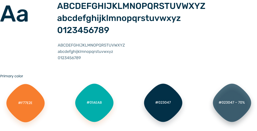
Rubik
Geometric sans serif typefaces have been a popular design
tool ever since these actors took to the world’s stage.
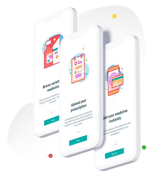
Onboarding Screens
Onboarding is the action or process of familiarizing new users with one's products or services. I embellished the illustration here to familiarize both buyers and sellers with the application at first look very well with a relevant fascinating visual instance.
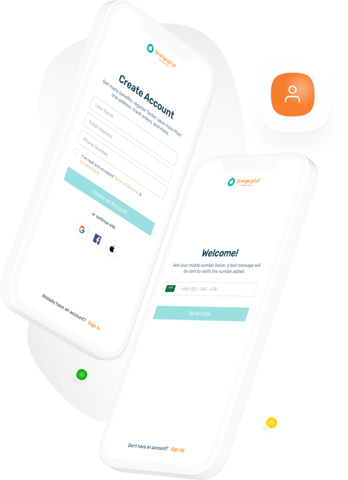
Simple Sign In & Sign Up process
I made the registration and login part very easy for users. Users can create an account on Google, Facebook, Apple. The verification process is provided by phone number. This is the easiest and fastest way to purchase goods.
Home screen
The Home page is moved immediately when the user sign in successfully. Here the user can get all the important information.

Element's explanation
-
Search bar. User can easyly search medicine by name. This app also gives opportunity to find product by categories, offers, saggesings.
-
List of Offers. This is the perfect way to show real promotions. Because the vast majority of buyers pay attention primarily to sales proposals.
-
Scrollabel List of Ad banners. This is the perfect way to visualization Ad pomotions.
-
Category Options. All available product categories were displayed in one place. Category banner elements that are used as a link to the product category page.
-
List of Company's Services. The perfect way to remind the user of the opportunity to have these services.
-
List of Beauty Offers. The list of offers was divided into the most popular product categories (Beauty, Mother & Child, Vitamins & Suplements, Personal care). This feature helps users easily find the product they need and make choices very quickly.
-
Scrollable List of Products. List ofthe most popular beauty products that correspond to the Beauty category.
-
Scrollable List of Products. List of trend subcategories of products. According to the results of purchases by buyers, this section shows which product was purchased the most and is more suitable for the user. Banner elements are used as a link to the product subcategory page.
-
Featured List of Products. List of featured Subcategories of products. Banners elements are used as a link to the product subcategory page.
-
Products item. The component consists of important elements: labels of promotional offers, the icon of adding to the wish list, the product name and the brand name.
-
Top Brands. Scrollable list of brands. Banners elements are used as a link to the product subcategory page.
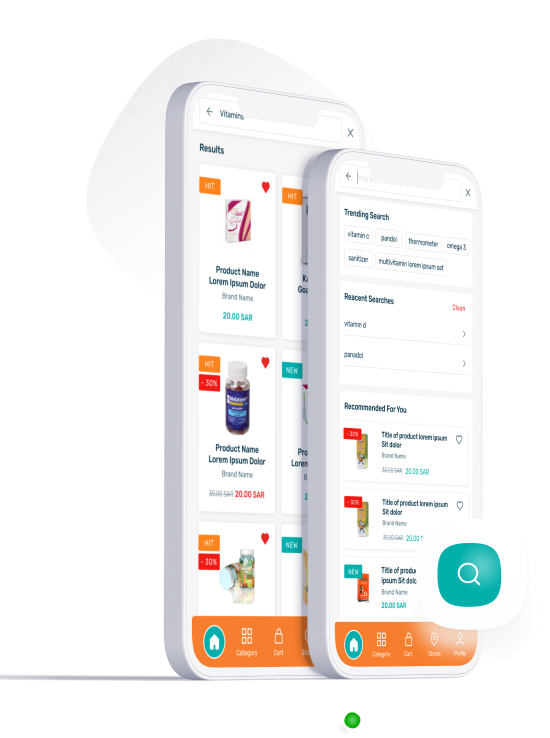
Search Pages
The autocomplete features was used to the text input (enhanced by a panel of suggested options). May suggest similar or previous searches to save the user time.
The user can easily search for the medication by name. This program also allows you to find products by category, offer, saggesins. Also offers you popular products through your order and search results.
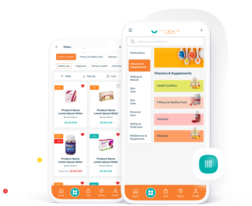
Category Pages
For the user's convenience, products are separated into many categories. The most popular sections are at the top, and the less popular ones are at the bottom.
Customers can navigate into the catalog through the types of products and using the search. Depends on how and what they are looking for. And they can easily filter out what they need inside the catalog.
Product Page
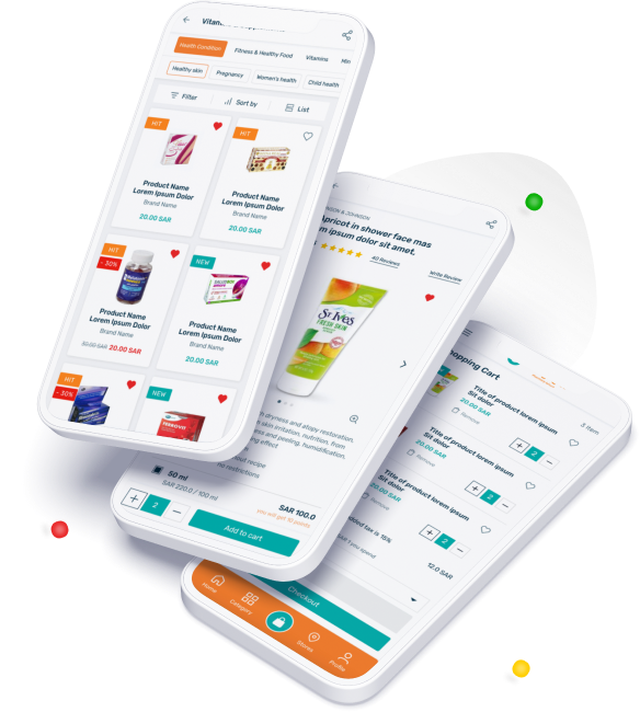
Product card displays detailed information about the product. The easy ”add to cart” option gives user to buy their desired product in desired quantity.
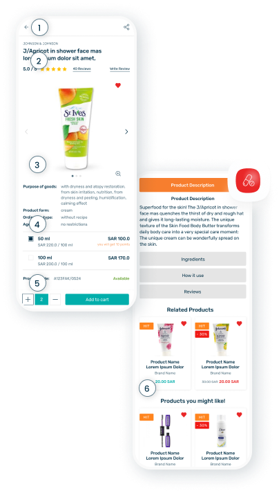
Element's explanation
-
App bar:top. Tap on the back button to go back to the Category page.
-
Customer reviews. After purchasing this good, the customer has the opportunity to write his own review.
-
Product description. Product cart displays detailed information about the product.
-
Available sizes. Apply preference from the available sizes.
-
Add to cart. Add items to cart to include in purchase.
-
Related Products. Shows products that are most often bought together.
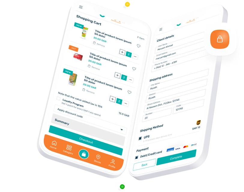
Cart & Checkout Pages
The "Add to Cart" button allows users to add any desired product to the cart at any time. User can easily check the cart list, can manage the quantity, get coupon and get informed about order processing. User can also remove an item from the list.
During the checkout process, the customer follows a series of steps to purchase the items in their shopping cart. This includes shipping details, payment options.
With thoughts on
our customers
An application turning shopping process into simple end
-to-end experience of buying the best medicines shopping
with the least possible time and effort


